Plotting
Basic data visualization is available in the Spine database editors. Currently, it is possible to plot scalar values as well as time series, arrays and one dimensional maps with some limitations.
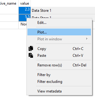
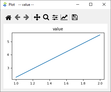
To plot a column, select the values from a table and then Plot from the right click popup menu.
Selecting data in multiple columns plots the selection in a single window.
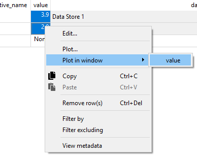
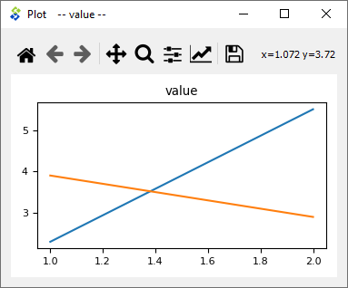
To add a plot to an existing window select the target plot window from the Plot in window submenu.
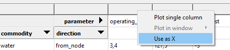
X column in pivot table
It is possible to plot a column of scalar values against a designated X column in the pivot table.
To set a column as the X column right click the top empty area above the column header and select Use as X from the popup menu. (X) in the topmost cell indicates that the column is designated as the X axis.
When selecting and plotting other columns in the same table the data will be plotted against the values in the X column instead of row numbers.